
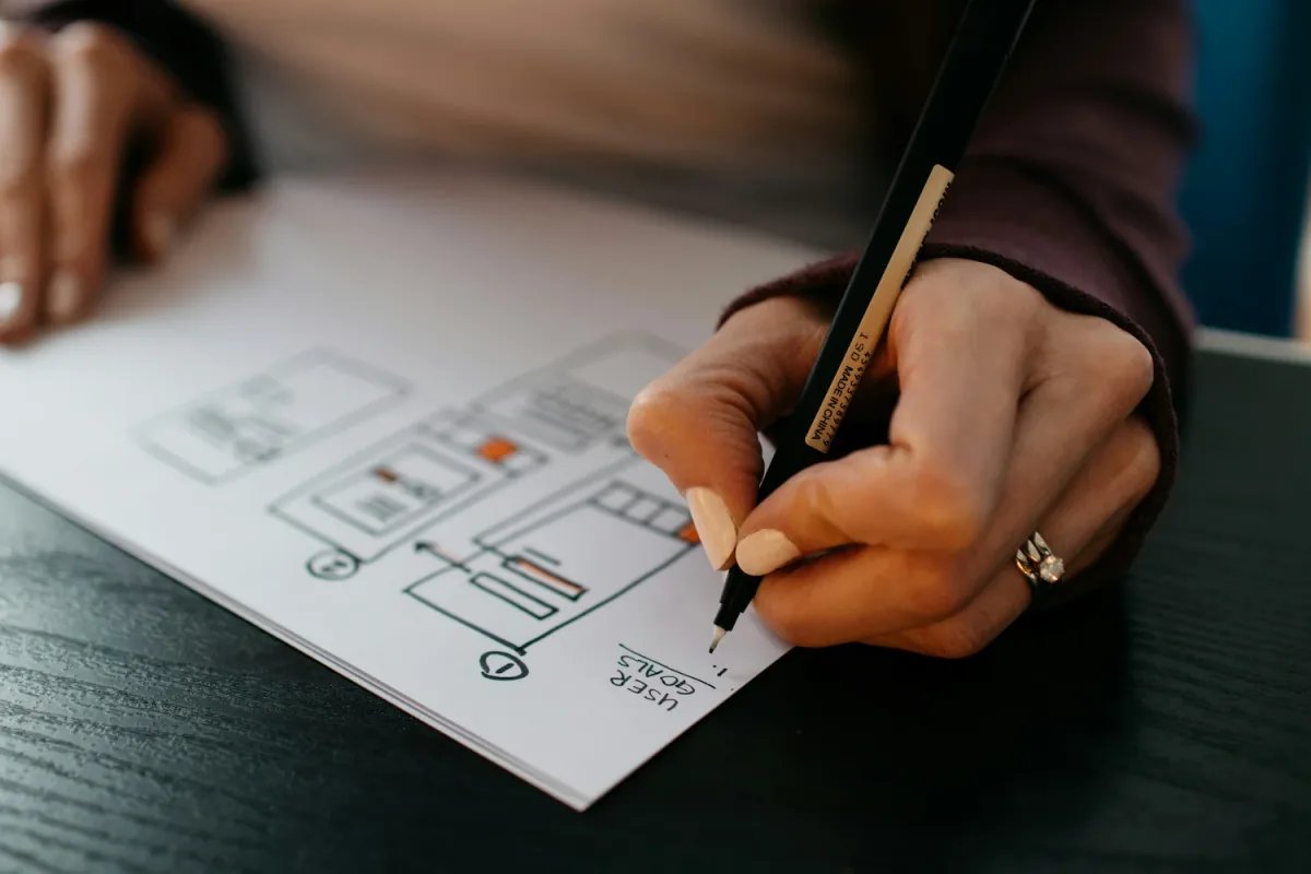
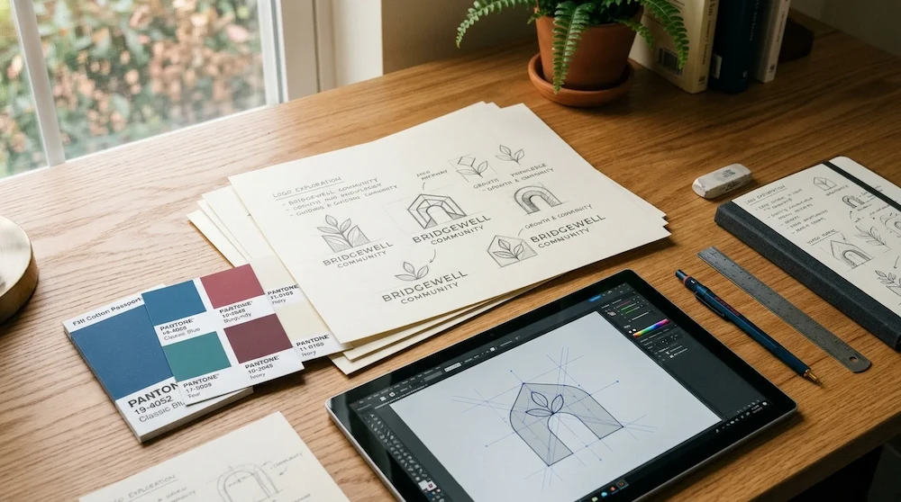
Every meaningful brand starts with an idea. Turning that idea into an enduring visual identity requires creativity, research, strategy, and deliberate design decisions.
At 3Flecha, we believe good design goes far beyond aesthetics. It communicates purpose, builds recognition, establishes credibility, and creates a lasting connection with the communities, supporters, and partners a brand seeks to reach.
As we work on an upcoming concept project that brings together logo design and website design, we are exploring how a clear visual identity can shape the way people experience an organization online.
“A logo does not simply decorate an organization. When designed with intention, it distills its mission into a visual anchor that builds lasting trust.”
Here is a closer look behind the scenes at how the logo design process works, how strategic choices guide every phase, and why each step matters.
1. Understanding the Brand Before Designing
Before drawing shapes, selecting color swatches, or exploring typography, the foundational step is gaining a comprehensive understanding of the brand.
A logo cannot tell a story if the story has not yet been articulated. During this discovery phase, we ask critical strategic questions:
- What does the organization stand for? What core mission, values, and principles drive its daily work?
- Who does it serve? Who are the primary audiences—students, families, educators, donors, community leaders, or civic partners?
- What makes it different? What unique perspective or solution does it bring to the sector?
- What emotions should its identity communicate? Should it evoke warmth, optimism, academic rigor, modern innovation, or steadfast stability?
For our concept project, the focus is on an education-focused nonprofit dedicated to creating better learning opportunities for students, equipping educators with essential tools, and strengthening local communities through equitable access to knowledge.
This foundation acts as a creative compass. It ensures the resulting logo represents genuine substance rather than arbitrary decoration.
2. Research, Discovery, and Inspiration
Great design begins with observant, disciplined research.
This stage involves exploring the organization's broader landscape: educational trends, community dynamics, visual vernaculars across civic and nonprofit sectors, and existing brand identities. The goal is not imitation—it is identifying opportunities to build something distinctive, memorable, and culturally resonant.
For an education-focused organization, visual inspiration often springs from deep conceptual themes:
- Growth and potential: Seeds taking root, upward trajectories, and emerging milestones.
- Guidance and mentorship: Beacons, stepping stones, open doors, and pathways.
- Knowledge and discovery: Pages, architectural arches, lenses, and interconnected geometric forms.
- Community and equity: Circles of inclusion, collaborative bonds, and collective elevation.
These concepts become the raw material for developing a visual direction that feels both authentic to the cause and immediately recognizable to the people it serves.
3. Turning Ideas Into Concepts
Once the conceptual direction is established, the creative process shifts into exploratory sketching and concept development.
This is where abstract notions translate into tangible visual forms through rough pen sketches, organic silhouettes, geometric studies, and typographic pairings.
Different concepts explore different facets of the organization's narrative:
- One concept might emphasize forward momentum and academic growth using upward angles and rhythmic lines.
- Another might center on human connection and mentorship through interlocking curves and supportive arcs.
- A third direction might highlight accessible knowledge through clean, modern, architectural emblems that suggest open classrooms and bright horizons.
Exploring multiple divergent directions allows us to evaluate which metaphor communicates the brand's purpose with the greatest clarity. The aim is never to create the most complex illustration; it is to uncover the simplest, clearest, and most memorable way to tell the brand's story.
4. Choosing the Right Colors and Typography
Color and typography are the primary emotional drivers of any visual identity. They set the tone before a visitor reads a single paragraph of copy.
Colors evoke immediate psychological associations:
- Deep Navy: Represents institutional trust, depth, security, and administrative stability.
- Teal & Sage: Evoke renewal, modern community growth, accessibility, and vitality.
- Warm Gold & Amber: Symbolize achievement, optimism, intellectual curiosity, and opportunity.
- Burgundy: Imparts brand heritage, conviction, human warmth, and grounded leadership.
Simultaneously, typography defines the voice of the brand. For an educational nonprofit, the typographic palette must strike a balance between academic credibility and warm approachability. An editorial serif heading paired with a clean, highly legible grotesque or geometric sans-serif for body text ensures that program descriptions, research briefs, and student stories are effortless to read.
Every color ratio and typographic pairing must work in harmony to build a welcoming, authoritative, and inclusive atmosphere.
5. Refining the Logo for Clarity and Versatility
A logo cannot merely look attractive in a presentation deck. It must function effortlessly across the full spectrum of modern digital and physical touchpoints.
During the technical refinement stage, we test and fine-tune every curve, stroke width, and negative space across rigorous practical criteria:
- Scalability: Does the mark retain its crispness and legibility at 16x16 pixels as a browser favicon or mobile navigation icon, just as well as on an outdoor event banner?
- Readability: Is the logotype instantly legible across quick glances, high contrast lighting, and diverse screen resolutions?
- Versatility: Does the emblem hold its integrity in single-color monochrome, reversed against dark backgrounds, or overlaid on documentary photography?
- Simplicity: Can a viewer recall the core shape after looking away? Unnecessary gradients, minute details, and clutter are eliminated in favor of clean lines.
- Consistency: Does the finalized asset align seamlessly with the organization's overarching design system and values?
This meticulous refinement transforms an inspiring artistic sketch into an enduring, versatile digital asset.
6. Connecting Logo Design With Website Design
A logo is the cornerstone of a brand, but it is only one component of a complete digital ecosystem. The website is where the brand lives, breathes, and interacts with the world every day.
A cohesive brand experience requires that the website build directly upon the visual foundations laid down by the logo:
- Unified color system: The logo's signature palette extends naturally into background tones, interactive buttons, callouts, and data visualization.
- Harmonious geometry: Subtle curves, arches, or clean geometric cuts from the logo mark inform container borders, image masks, and section dividers.
- Consistent tone and typography: The voice established in the brand identity carries directly into headline hierarchies, microcopy, and editorial narratives.
For our concept project, we are demonstrating how the logo and website work together in tandem. From the very first hero section to exploring educational programs, meeting educators, reviewing impact metrics, and signing up to volunteer, every interaction feels deliberate, welcoming, and intuitive.
7. From Concept to a Complete Visual Identity
The final phase brings all strategic and artistic decisions together into a comprehensive design framework.
The primary emblem, wordmark, secondary lockups, brand color tokens, typography scales, iconography guidelines, and responsive web components are codified. This ensures that as the organization expands its outreach—welcoming new schools, launching regional programs, publishing research, or coordinating with institutional donors—its visual presentation remains unified and dependable.
A powerful visual identity is never the result of a single hasty decision. It emerges through a series of thoughtful, interconnected choices, each anchored to a clear underlying purpose.
Something New Is Taking Shape at 3Flecha
We are currently putting the finishing touches on our new concept project, which showcases this comprehensive approach in action: unifying logo design, website architecture, and mission-driven storytelling for an education nonprofit.
This initiative provides an opportunity to bring strategy and creativity together, illustrating how intentional design empowers organizations to communicate their purpose with clarity, engage their communities, and multiply their real-world impact.
We look forward to unveiling the full creative direction, design systems, and interactive digital experience as the concept project launches.
Stay tuned for our upcoming concept project! Follow along as we continue sharing behind-the-scenes insights, from early sketches to the completed website experience.
If your organization is looking to modernize its visual identity or build a high-performance digital presence, connect with the team at 3Flecha. Let's build digital solutions that elevate your mission and move your community forward.